The Power of Color in Branding: Unleashing the Psychology of Color
Colors are the unsung heroes of branding, wielding the incredible power to evoke emotions, influence perceptions, and shape decisions. In the realm of marketing and design, understanding the psychology of color is akin to holding the keys to a world where visual communication transcends words.
In the world of branding, every color choice is a strategic decision. Behind the seemingly simple selection of a color palette lies a complex web of psychological associations and emotional triggers. Color is a potent tool that can communicate a brand’s personality, evoke specific emotions, and influence consumer behavior.
In this exploration of color psychology in branding, we’ll delve deep into the fascinating realm of hues, shades, and tones, uncovering how they shape our perceptions and decisions.
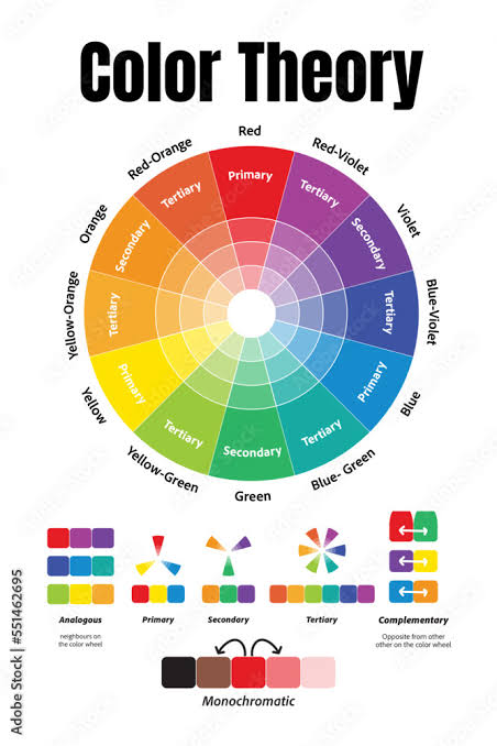
The Language Of Color
Colors speak a language of their own. They convey messages and meanings, often without words. It’s a language deeply rooted in our cultural and biological heritage. For example, red, the color of fire and blood, is universally associated with strong emotions such as love, anger, and passion.
Green, reminiscent of nature and growth, symbolizes freshness, health, and tranquility. Blue, the color of the sky and the ocean, exudes trust, calm, and reliability.
Creating Brand Personality
One of the most profound impacts of color in branding is its ability to shape brand personality. When consumers interact with a brand, they form emotional connections. These connections are influenced, in part, by the colors used in the brand’s logo, website, and marketing materials.
Red: This color commands attention and evokes strong emotions. Brands like Coca-Cola and Netflix use red to signify excitement, energy, and boldness.
Blue: Blue is the color of trust and professionalism. Companies like IBM and Facebook employ shades of blue to convey reliability and stability.
Green: Green is synonymous with health and sustainability. Brands like Whole Foods and Starbucks leverage green to communicate their commitment to wellness and the environment.
Yellow: Yellow radiates positivity and optimism. Brands like McDonald’s and Best Buy use yellow to create a cheerful and friendly image.
Black: Black is associated with sophistication and luxury. Companies like Chanel and Rolex employ black to convey elegance and exclusivity.
These associations are not arbitrary; they are deeply ingrained in our collective psyche. Successful brands use color to align their image with the emotions and qualities they want to evoke.

Eliciting Emotions
Color psychology goes beyond personality; it delves into the realm of emotions. Different colors have the power to elicit specific emotional responses.
Red: As a stimulant, red can increase heart rate and create a sense of urgency. It’s associated with excitement, passion, and love. Brands like Coca-Cola use red to trigger feelings of energy and enthusiasm.
Blue: Blue is calming and soothing. It can lower heart rate and reduce appetite. It’s often associated with trust, peace, and stability. Social media platforms like Facebook and Twitter utilize blue to foster a sense of security and reliability.
Green: Green is associated with nature and growth. It conveys feelings of freshness, harmony, and balance. Brands in the health and wellness industry, like Whole Foods, tap into green to signify health and vitality.
Yellow: Yellow is bright and cheerful, evoking feelings of happiness and optimism. It’s often used by brands to create a sense of warmth and friendliness. Fast-food giant McDonald’s employs yellow to make customers feel welcome and comfortable.
Purple: Purple is associated with creativity and luxury. It can stimulate the imagination and create a sense of luxury and sophistication. Brands like Cadbury and Hallmark use purple to convey a sense of elegance and creativity.
By understanding how different colors evoke emotions, brands can strategically use color to create the desired emotional response in their audience.
Influence on Consumer Behavior
Color psychology doesn’t just stop at emotions; it extends to consumer behavior. The colors used in branding can influence purchasing decisions, brand loyalty, and even the perception of product quality.
Impulse Purchases: Warm colors like red and yellow can create a sense of urgency and encourage impulse purchases. Clearance sales signs are often in red or yellow to prompt quick decisions.
Trust and Reliability: Trustworthy brands often use blue and green in their branding. When consumers trust a brand, they’re more likely to become repeat customers.
Perceived Value: Black is often associated with luxury and quality. Even though a product might be identical in function, consumers are often willing to pay more for a product in black packaging, perceiving it as higher quality.
Brand Recognition: Consistency in color across all brand touchpoints fosters brand recognition. The iconic blue of Facebook or the golden arches of McDonald’s are instantly recognizable worldwide.
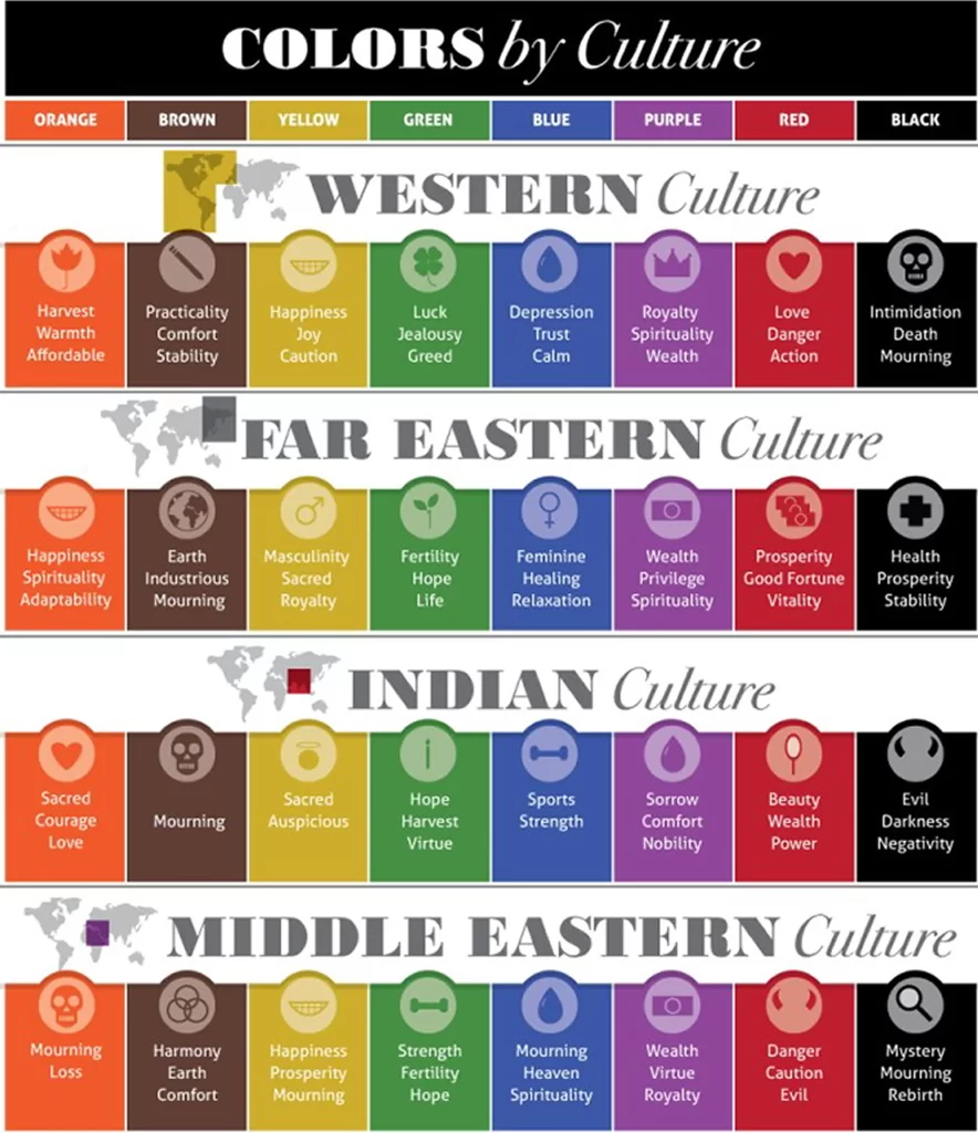
Cultural Variations
While there are universal associations with colors, it’s important to recognize that cultural factors can significantly influence color perceptions. For instance:
White: In Western cultures, white often symbolizes purity and cleanliness. In some Asian cultures, it is associated with death and mourning.
Red: While red is associated with love and passion in many cultures, it symbolizes luck and prosperity in Chinese culture.
Yellow: In Western cultures, yellow is often associated with happiness and positivity. In some Latin American countries, it can symbolize death.
Brands with a global presence must be mindful of these cultural variations when choosing their color schemes to avoid unintended negative associations.
The Power of Consistency
One of the most crucial aspects of color in branding is consistency. Brands that maintain a consistent color palette across all their materials create a strong and lasting impression. This consistency reinforces the brand’s personality and helps with recognition.
Think of the golden arches of McDonald’s or the red and white of Coca-Cola. These brands have used consistent colors for decades, and those colors have become synonymous with their identity.
Conclusion: Mastering the Art of Color in Branding
Color psychology is a potent tool in the world of branding. It’s a language that communicates emotions, shapes brand personality, influences consumer behavior, and fosters recognition. To harness the power of color effectively, brands must understand the cultural nuances, emotional triggers, and associations that each color carries.
Successful branding isn’t just about choosing a color; it’s about using that color strategically to create a holistic brand experience that resonates with the audience’s emotions and values. In the end, the right color, used in the right way, can transform a brand from ordinary to extraordinary, leaving a lasting impression on consumers’ minds and hearts.
READ MORE : 5 WAYS TO BUILD YOUR ONLIUNE PORTFOLIO